

Branding often starts before the building exists. Investors, city officials, brokers, and future tenants meet the idea first, through a name, a deck, early visuals, and a handful of story cues. That’s why early brand decisions matter: they shape confidence long before anyone sees a finished space.
Here are seven common mistakes we see developers make, and how to avoid them.
Mistake no. 1: Starting with a logo before defining the story
A logo can’t rescue unclear positioning. If you haven’t defined who it’s for, what it stands for, and why it’s different, the identity becomes decoration.
Do instead: Start by defining the project’s positioning: who it’s for, what need it addresses, what makes it different, and how you want people to perceive it. Once the strategic foundation is clear, the visual identity has something meaningful to express.
Mistake no. 2: Designing for launch instead of the full project lifecycle
Many brands are built for the “big reveal,” then fall apart when the project needs updates, phases, sub-announcements, leasing materials, and partner content.
Do instead: Build a modular system that can live across planning, pre-leasing, construction updates, launch, and handover.
Mistake no. 3: Looking like every competing development
Real estate suffers from a visual sea of sameness: safe type, safe colors, safe language, safe renders. If you look like everyone else, you’re harder to remember.
Do instead: Define one clear differentiator (audience, place, experience, or point of view) and design a recognizable signature around it.
Mistake no. 4: Treating digital as an add-on
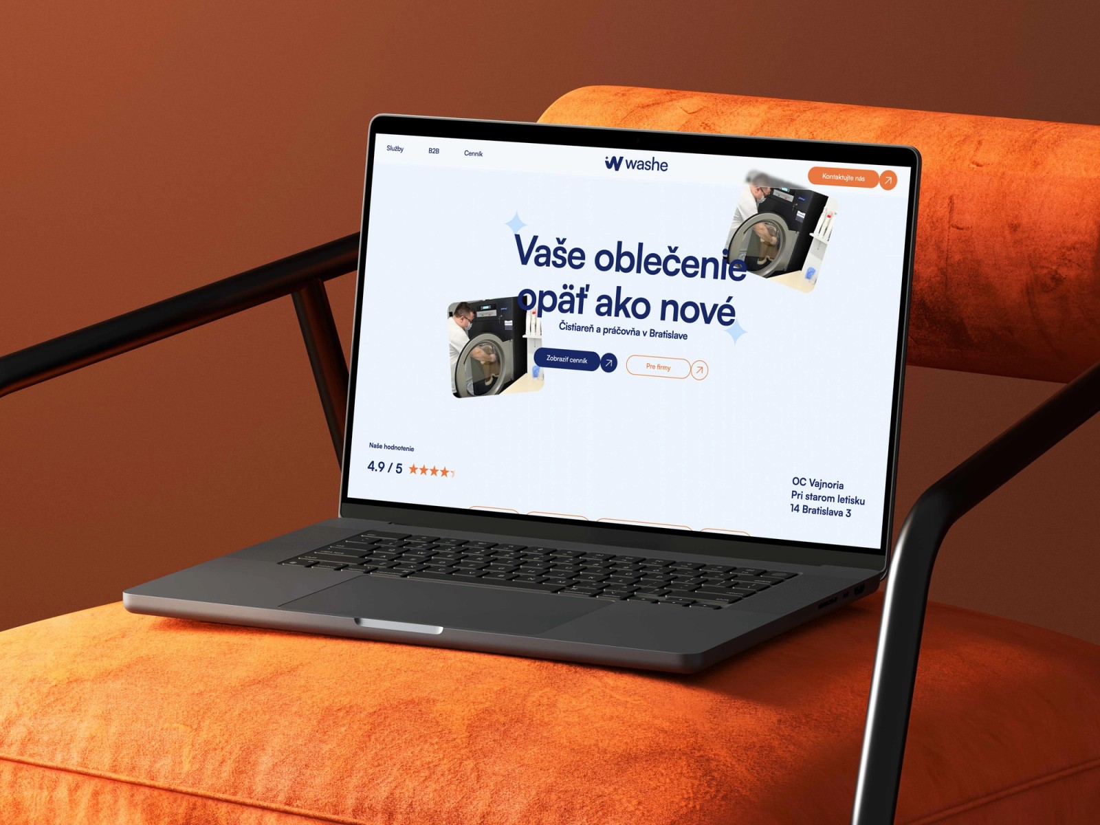
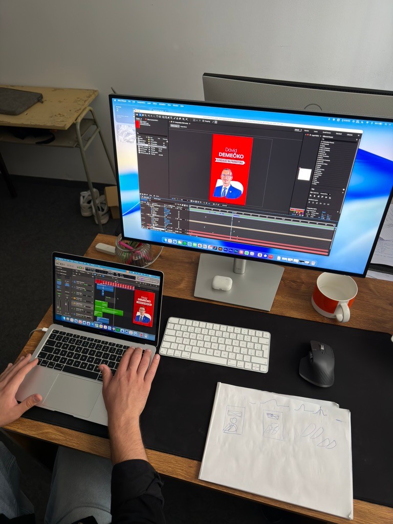
Most people will “visit” your project online first: website, digital brochure, ads, social, render galleries. If the brand is built only for print, it won’t translate.
Do instead: Test the system early on mobile, web layouts, and simple social templates, not just posters and brochures.
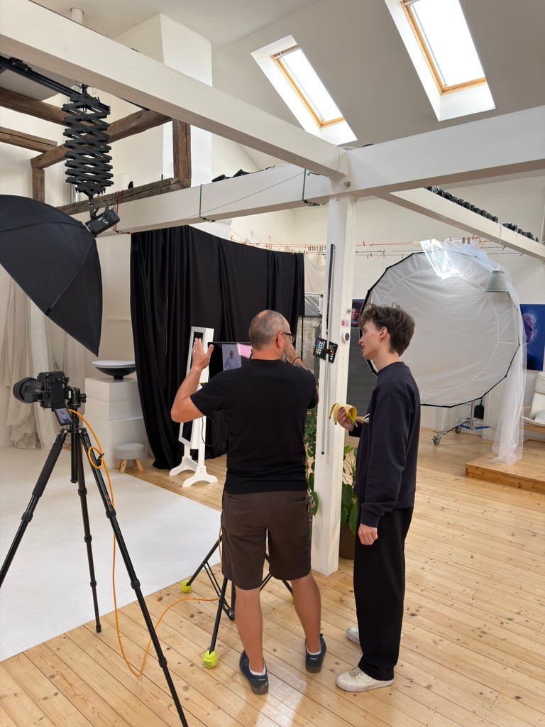
Mistake no. 5: Treating CGI, photography, and design as separate worlds
When imagery and design aren’t art-directed as one system, the project feels fragmented even if each asset is high quality.
Do instead: Define one look and feel across CGI, photography, and graphic design: mood, contrast, composition, overlays, and type rules.
Mistake no. 6: Building a campaign instead of a scalable identity
Trendy seasonal aesthetics date quickly, while real estate timelines are long. A short-lived “theme” can’t carry years of communications.
Do instead: Build durable foundations: type hierarchy, layout grid, color rules, graphic language, and repeatable templates.
Mistake no. 7: Underestimating consistency
Inconsistency doesn’t just look messy; it signals risk. If every partner interprets the brand differently, trust drops.
Do instead: Create clear guidelines and usable templates, and assign a simple review process so the system stays intact.
Here’s a quick gut-check: if you can’t explain the project in one sentence, or the brand only works in one format, the foundation isn’t ready yet.
And if you’d like help sharpening the positioning or translating it into a visual identity system, reach out. We’re happy to help you choose the best “outfit” for your next development.